792 points by ereiamjh about 8 hours ago | 475 comments | View on ycombinator
ajjenkins about 6 hours ago |
vova_hn2 about 6 hours ago |
Of course, a "Japanese Minimal Poster" has a sakura and a stylized flag of Japan, duh
A human designer would probably think that "Japan -> sakura" and "Japan -> Japanese flag" are way too obvious, too banal, too stereotypical, and, most importantly too boring. And then they would probably sit for a while and try to think of something fresher and less clichéd.
But AI has absolutely no problem with going with the cheesiest, most overused trope.
JSR_FDED about 7 hours ago |
But there’s another reason it drives people crazy - it’s low effort trying to present as high effort. If the sign was simple Comic Sans then it would at least be charmingly honest.
jstummbillig about 4 hours ago |
No, you silly geese. What you are able to spot is somebody using AI poorly. That's not you developing taste. It's the equivalent of being able to tell something is photoshopped because somebody used a default brush poorly, or masked something poorly and then confounding using Photoshop with using Photoshop poorly.
You have absolutely no way of telling when a good designer created something entirely using AI (unless they are fine with you knowing that) and that has always been true.
mrob about 6 hours ago |
At the top of the page we have a deformed wireframe sphere. A wireframe sphere is stylistically appropriate, but the incorrect rendering is not. The "CGI" aesthetic requires obviously computer generated lines, which in the 90s meant accurate and regular lines.
Next we have a messed-up stellated polyhedron, and a messed-up dot pattern. These also fail for the same reason. The main 3D rendering is also obviously broken, as are many other small details.
But the biggest failure is the complete misunderstanding of the culture. 90s DnB was absolutely not about "good vibes". The smiley face logo is completely inappropriate; that's associated with late 80s/early 90s rave culture, pre-DnB era. 90s DnB was much darker and edgier in tone. The scene was almost exclusively male, and it maintained a aggressive vibe carried over from jungle.
A 90s DnB event would never advertise "bringing communities together". Audiences would be repelled by such messaging. This is despite it actually doing just that, as the scene was racially integrated in a way that mainstream music at the time was not. If there's going to be pro-social messaging on the poster it has to be there only implicitly.
petetnt about 7 hours ago |
blargey about 2 hours ago |
I guess you can justify ignoring such "advanced" techniques if it's aimed at the literally-zero-effort crowd, but who from there is reading this?
weinzierl about 3 hours ago |
Minimalist designs have much less opportunity to insert "personality", be it that of a designer or that of an AI. No wonder they look less AI-generated, and when they do it is because some "AI-baroque" slipped through. Fancy unicode characters no human would think of are the salient one in OPs examples.
It'd be much fairer to compare AI and human for the same desired style, and yes a lot of AI-generated stuff is immediately recognizable because no one bothered to tell the AI about the desired style.
psion about 4 hours ago |
And I have found that if you are paying for an AI service to get these generic, wrong sized designs, you could have spent just as much going on Fiverr and gotten something that doesn't need to get a full style revision.
glenstein about 5 hours ago |
This is one of the better statements of the issue right here. I think because people dislike the actors and economics surrounding AI they also feel a need to categorically reject any of it's products, but it's not necessarily bad in the sense of poor aesthetic taste as it is bad in it's lack of a appreciating that being novel as a style matters almost as much as the actual style and direct repetition teaches us not to like the style itself.
royosherove 14 minutes ago |
bariumbitmap about 1 hour ago |
https://allevents.in/mattapan/fix-it-clinic/200026636930752
Here's what I like about it: it communicates. What, when, and where. And crucially, photos showing what the event looks like. Photos of real people fixing real things.
The author demonstrates that AI-generated posters can imitate many artistic styles besides the generic default, but these examples suffer the same problem as all template-based posters: they don't communicate what the event is actually like. What does a samba band performance look like? (There are drums, I guess?) What does a circus skills workshop look like? (There are juggling clubs, I guess?)
These posters may be more aesthetically pleasing but none of them make me interested in going to the event.
beloch about 6 hours ago |
We've officially reached that point with advertisements. Save your tokens. Hire your 9-year-old niece to draw the poster by hand and you'll likely get a far better reaction from most people. Nobody goes to a fair because the poster had a "modernist / Bauhaus-influenced graphic style".
binary0010 about 4 hours ago |
Not because they looked good, but because they used a design language that "at-a-glance" said what the event was. Sure, the designers republic/etc looked less commonplace, but if I was looking for a fun local faire I would absolutely never notice those posters and if I went i'd assume it was a completely different type of event than it is (e.g. some sort of modern art faire).
Every one of those posters didn't fit the medium idea at all (local faire event) except the child's drawing one could maybe pass.
In fact I can almost guarantee that all the posters in this article would perform worse than the originals if you were to test them on the street or in a facebook group.
If you are an actual production/commercial designer, your first goal is to understand what the clientele wants and converts, secondarily make it beautiful.
This failed both, zero understanding of the purpose of commercial art (to speak to the actual clientele and bring in more people) and ugly within their own design language (but yes, less common).
Would have been interesting to try and make designs that actually make sense for this product AND are a bit less generic.
eleventen about 3 hours ago |
For example, Sure, you can make a craven facsimile of punk art for your poster. But that art style signals to punks that other punks are going to be there. You would never reproduce that style using traditional methods because you are not a member of that artistic tradition.
You should keep the originals. They signal to AI slopsters that this is a great place to meet other slopsters.
zakki 6 minutes ago |
samuba about 7 hours ago |
A_D_E_P_T about 7 hours ago |
I suspect that the same thing is happening here -- as other comments note: lack of distinctiveness, uniformity -- but that the low information content of posters prevents it from becoming immediately obvious.
DalasNoin about 1 hour ago |
Some time ago, I was in this apartment complex and there was a hand drawn sign of a dog pooping on the grass - the sign then said that residents should pick up after their dog. It looked like the locals living in the apartment complex had their child draw the dog pooping in a slightly adorable style. I remember feeling kind of happy about this, like I could see a kid sitting there with some crayons painting this dog. I know there were human artists perfecting this child like style before but still feels like some humanity is getting lost here making AI paint like a kid.
GarnetFloride 20 minutes ago |
bananaflag about 7 hours ago |
throwaway13337 about 6 hours ago |
The real photographers knew they were shit photos. They were grainy, bad lenses, and ugly. A lot of people still liked them because they were much more convenient for a lot of uses than the film ones.
Well, I guess there's still a lot of film people. But film had a ceiling. Digital cameras kept getting better.
The adaptive film photographers eventually adopted the tool. A lot of their skills transferred well to the new medium. Most waited until the cameras got good enough, though.
I'm not sure when that'll be with AI art gen. Seeing scenes broken up into layers in the latest gpt image generation, though, made me think we might be near.
TomMasz about 3 hours ago |
ereiamjh about 8 hours ago |
But I'm convinced that just vetoing AI is to throw away the baby with the bathwater. So I set out to prove it.
sktrdie about 6 hours ago |
But that's how the algorithm behind LLMs functions. It simply cannot create something unique by stepping out of its existing knowledge base. It has to refurbish existing data, because, well, that's all it has.
One might argue that a human artist also is refurbishing data, made out of experiences and knowledge it has gather throughout its life.
The difference I think comes from something extra (that we're entirely dumb-founded on) that the human mind can contemplate and extrapolate from, to be able to generate something truly unique and different.
I hope (and believe) this extra magical capacity is what will not allow AI (at least in its current statistical form) to be able to match us in terms of creativity & uniqueness.
pmlnr 29 minutes ago |
It's not horrible, no: it's off enough to make one feel uneasy looking at it without being able to pinpoint the problem.
EagnaIonat 26 minutes ago |
rozab about 4 hours ago |
I think the signature noisy, crowded, HDR-y look shows these posters are being spat right out of a diffusion model. They always have an image background with the classic light halos around text.
When I one-shot a poster out of Gemini or whatever, I can't make anything nearly as bad as the ones I see every day. What on earth are people even using to make stuff that bad?
smy20011 21 minutes ago |
onaclov2000 about 3 hours ago |
I should be fair (no pun intended) there was one booth that had mini donuts that I felt were better than the AI generated poster advertisement, but the rest of the food I ate, was certainly not.
gorfian_robot about 1 hour ago |
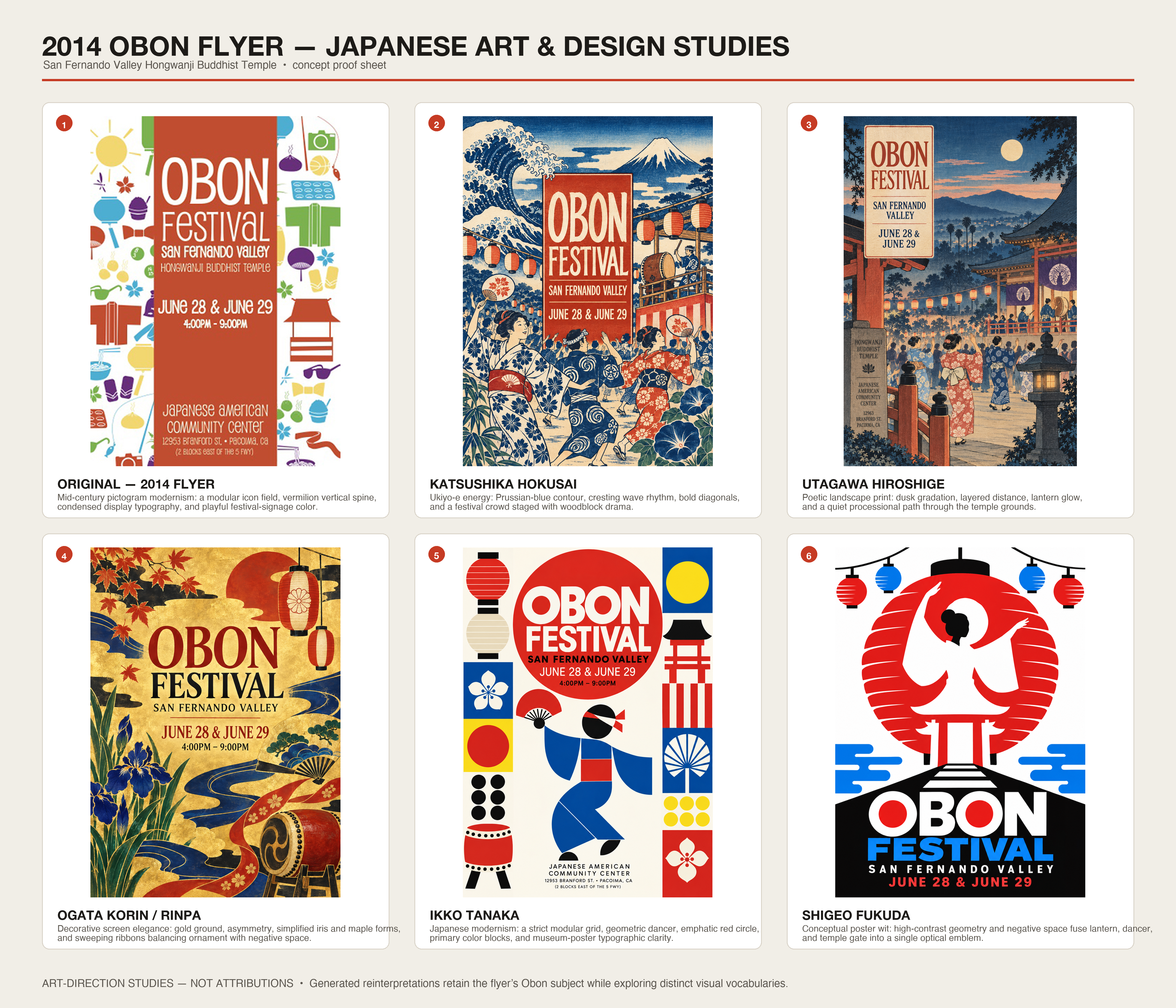
"look at this image and give me variants in the style of classical japanese artists and graphics designers (be sure to include hokusai and Ikko Tanaka). be sure to tell me about each style. upscale and include the original with some designer words that are plausible"
at least two of these don't look like AI to me and are perhaps better than the original. but a non-designer is likely to pick the more busy ones.
CraigJPerry about 7 hours ago |
The only reason i couldn't tell memphis is because it's aping a known design language already, it's just a perfect copy so me not being able to tell it wasn't AI isn't a free pass in this case.
I think if there was a little less "grid" feeling to the layout details then i wouldn't be able to tell on a few of the other designs either.
Edit: the designers republic version is quite a lot different than the others, it's not just that it's the only design to avoid pairing every feature with an icon, it's the whole layout variety - there's different font sizes, the positioning of elements is very well done to my eye. I'm gonna say this has to be another case like memphis, there's some pre-existing design language that i don't know of and it's just aping that. It's much more human than the others which i can believe are straight ai.
xg15 about 1 hour ago |
docheinestages about 1 hour ago |
Kreutzer about 5 hours ago |
atrus about 7 hours ago |
anonzzzies about 7 hours ago |
bob1029 about 6 hours ago |
However, you must retain control over the scene graph and its composition. Use the output of the AI to guide how you work it. Do not assume the AI system has the ability to simulate world space with any meaningful fidelity. You can move transforms around in Blender and Unity with floating point bit increment/decrement operations if you wish. LLMs will never have this level of control.
Lighting systems are an entire universe of reasons you should do it the hard way too. Being able to iterate light placement and intensity with nanometric precision starts out looking like a brick wall, but it turns into a superpower once your scene is halfway decent.
I can usually tell when someone used AI to do things like generate steam store art because their camera doesn't change in a physically plausible way between the horizontal and vertical layouts. When you have access to the raw scene you can place the same camera in multiple orientations without altering any other aspect of the scene. The header capsule and vertical capsule are very difficult to make look coherent if you are using an LLM to generate these assets. Your best bet with AI art is to render something so big that it can be cropped for both, which is also quite obvious and ugly. Being able to instrument a scene as if it were a real place is way more productive than an LLM once the scene is ~done.
agnishom about 7 hours ago |
The problem is that using AI to create the posters show a lack of willingness to put in effort, and it makes you question whether the producer cares about the product and whether they care about the large scale societal problems related to the usage of post-2022 transformer based neural networks.
codingdave about 4 hours ago |
That is why, even if the look of a poster is OK, they are failures. Because they forget that the reason these advertising posters exist is to communicate something that is going on. A nice look to them is a bonus, not the core purpose. So claiming that AI isn't doing a horrible job is because the author is misunderstanding what the job is in the first place.
muzani about 5 hours ago |
If you're short on time, you can ask AI to summarize into a certain time and craft the prompt from there. But it's better to figure out what you really like.
ChatGPT tends to fall to the same things, but many of the other image generators do much better.
specproc about 3 hours ago |
There's a menu for a place in my town and it's completely illegible. They printed the same thing in three sizes, and you need a magnifying glass to see the text on the smallest two.
Accessibility matters, and is part of the job of a designer. The problem with AI tools is that by skipping the expert, you risk making some horrible mistakes.
prism56 about 1 hour ago |
graypegg 15 minutes ago |
But I'm fine with the beer festival phoning it in. I guess my only issue with the in-the-wild poster example you found is it does look... bland and just aestetically bad. Your example AI poster styles would be a huge improvement! I can't say they're like, impressive in anyway or winning any awards since they're also bland, but aestetically they hold up and IMO, actually communicate the info better than the ez-slop original.
Maybe to put it another way: if it was 2015, and an craft festival and a beer festival both used the same incredibly lame looking Word template for posters, I'd have the exact same opinion.
throwawayffffas about 6 hours ago |
PS: Which then survives in the next iterations as "A day of music, making and family fun"
Edit: Ah just saw the call out on the previous iteration.
But still it's a nice display about the semantics encoded in the models.
kenjackson about 5 hours ago |
user00005 about 1 hour ago |
abustamam about 2 hours ago |
mjmvisser about 4 hours ago |
joddystreet about 2 hours ago |
Not horrible is - caring about the outcome, and using AI to make it possible, irrespective of the skill level.
Horrible is - everyone trying to copy paste someone else’s work without caring.
I think, human thought + ai built is the “not horrible”, might even be awesome
in_absentia about 3 hours ago |
walthamstow about 7 hours ago |
powerteacher about 5 hours ago |
These posters don't have the feature of readability. They inconsistently apply the required design principles for this. Removing some of the clutter helps, but a WordArt poster from 1992 is still a better final product for the purpose.
Taking the last poster as an example (1940s cubist style), the graphic seems almost designed to draw your eye towards blank space. This, very precisely, detracts from the goal: the graphic is providing negative value!
Whereas, genuine 1940s cubist art exhibition posters are really astonishingly good at communicating the key information. As one example, https://artposterarchive.com/products/edward-wadsworth-vorti...
amelius about 7 hours ago |
I'm starting to think that icons are in fact the low-effort way to convey information. It's design you can just throw in anywhere without adapting it to context (except for maybe changing color).
amelius about 6 hours ago |
I don't often say this but those jobs are ripe for replacement by AI. It won't do worse!
zdc1 about 1 hour ago |
r_lee about 7 hours ago |
I really wonder what's going on in the minds of those who make the shitty AI posters? like, are they that unaware?
for me when I see them I just get instantly repulsed
geoffbp about 2 hours ago |
This is really cool! I don’t ever make posters - but I can imagine these being super useful
skybrian about 6 hours ago |
Similarly, it would be nice if there were common styles for posters that you could just use and an AI could generate and nobody would criticize you for. Not everything has to be an original design.
LogicFailsMe about 4 hours ago |
For me it's about the unconventional analogies they try to express combined with their layout that even a couple crude 8.5x11 Excel plots and a poster author express better. And the human factor is an important component of poster sessions IMO.
loopydosuette about 6 hours ago |
to me, they all look like lazy-prompting, which is the only way I ever do genAI imaging, because I fail to see why that "CPU" should be wasted on something I barely even care for.
That said ... let kids do that shit and pay them 50 or 100 bucks ...
The issue is that in my walled garden, I have not seen any of the good AI stuff. My wardens still use some home trained GPT 3.5 for most stuff, including their songs on potify and bootube. And i can't get access to current top level public AIs, either. Had the actual ChatGPT and Claude models for some while but I knew why ... otherwise I might put effort into semantics, syntax, grammar and my image generation prompts, which currently look like some MITM is speedrunning collages using haiku cowork and crayons or something ...
sajithdilshan about 6 hours ago |
userbinator about 7 hours ago |
elondaits about 2 hours ago |
- The main issue with AI posters and flyers is almost uniform information density. They read as "too crowded". Posters should, like photographs or paintings, have a rhythm where some areas are high density and others act as negative space, and provide a more restful transition between information areas.
- The icons as bullet-points are a big AI cliche, and for the most part useless. Nobody needs an icon of a cupcake to understand what "cake" means and most of the other icons have no clear interpretation. Icons are only useful when, by themselves, communicate the idea (like the typical toilet icon). It's telling that every poster includes them.
- AI is not brave enough, or wise enough, to leave some blank space. Blank space is the #1 design resource.
- Font and visual style should not be arbitrary aesthetic choices, but rather motivated ones. They could relate to the event or the place through its history, culture, biome, or through the utopian vision of what the organizer is trying to bring to life. There should almost never be a legitimate choice between "Should we use Japanese, Punk or Kid-drawing style?"
- Being honest, earnest, truthful, is better than being cool.
- If a poster for an event calls your attention you can scan for the date, time and place. They will be there somewhere. But before you get there, there'll be important questions: "who organizes this?" "who is this for?" "what's the vibe going to be like?". Only a few of the posters try to partially provide this information through very small sentences (e.g., "A day of music, making and family fun")... but it's hardly enough. In my opinion this is what 80% of the time designing the poster should be spent on... looking nice and "professional" won't inspire trust or create commitment.
iamflimflam1 about 6 hours ago |
Times, dates, location, pricing, parking etc…
As he points out “it added a bunch of text…” now it’s one all the future designs. That’s great - is the text correct?
To be honest this was a problem before AI. People are not very good at communicating.
egeozcan about 5 hours ago |
They were/are not great. While I agree that spending extra 10 minutes improves the results, AI stuff are also not amazing. I think there's nothing surprising about this.
blaze33 about 6 hours ago |
For legibility: the first examples are bad because they fail to easily communicate what/when/where/details in a couple seconds, mainly because the profusion of visual clutter obfuscates the message. The latter examples fare much better on that regard.
Usability is a constraint maybe more applicable to websites like the discussion I saw the other day on the design of claude-written pages (all look the same, feels ok but good UX probably lacking).
dubeye about 5 hours ago |
Guess it’s subjective. I’m looking for fair info. He is looking for design uniqueness.
ks2048 about 4 hours ago |
sdcfgy about 5 hours ago |
RomanKornev about 7 hours ago |
Just like in engineering.
Retr0id about 5 hours ago |
Except for the "professional graphic designer has added typography to a poster paint drawing by his young child" one, I'd go as far to say that I actually like it, especially if you were to remake it with the assistance of an actual child.
tecleandor about 5 hours ago |
lennartb about 2 hours ago |
hermitcrab about 7 hours ago |
I guess it is like the early days of wordprocessing, where you saw Comic Sans everywhere.
insightfulornot about 6 hours ago |
Kuyawa about 4 hours ago |
I've been doing that for the last six months and the results are more than spectacular for the apps I build
So no, 'create an inventory app' is not enough, you have to be specific in every sense, every detail of the tech stack, phases, checklists, roadmaps, decisions, everything that makes AI's life easier (less mistakes to make and fix) and yours too.
Next time, start with "Let's have a brainstorming session about an [inventory] app we will create and at the end write a very detailed prompt.md, here is the initial context... ask all the questions you may have before writing any code"
* Replace [inventory] with any other app you may need
And remember one thing, AI is a multiplier of both our intelligence and our stupidity, the outcome will reflect that
Edit: The link at the end deserves some exposure, it's the work of the author showcasing 100 prompts for different designs [1] and some people won't get there because tl;dr or short attention span. Get them, use them, learn from them
dubeye about 5 hours ago |
peri-cl about 6 hours ago |
The analogy in my mind when I read this post was: you are asking a machine to paint a color, but the machine always paints the exact same shade, deterministically; and you'd like to explore different colors, but somehow you don't know anything about colors, don't know any of their names. So you don't have the language to ask for what you can't name.
Random sampling of colors (without names!) is a solved problem, because we've parameterized the entire universe of colors that can be perceived. It's just a very low dimension manifold, and there's even a computable metric on it such that unit-distances in that metric are what humans say are color differences of equal step size.
Are there more general versions of this? Like: "Here's a list of every human art in history: infer a coordinate system that uniformly metricizes every art that can ever exist?"
Kim_Bruning about 5 hours ago |
The problem with a lot of AI is that the baseline is already past "good enough" for many folks.
But you can also imagine a very different approach:
Imagine if you start with a vision, and just happen to use AI tools as part of your process to realize that vision, just-like/along-with many other implements. I've seen examples where people put together many layers in photoshop or gimp, and mix with rendering, hand drawn art, photographs, etc. Very much like how some of the better programmers work with AI assist.
undefined about 3 hours ago |
l3x4ur1n about 5 hours ago |
sarchertech about 6 hours ago |
But more importantly, if you aren’t the kind of person who could make a halfway decent text only poster before, you are going to make the posters at the top of the article. Those are objectively harder to read than something typed up in word.
You aren’t going to know to tell the AI to “ Go for a clean, unfussy, bright layout with a bold striking spring-themed graphic. Avoid pastel/airbrush/oil style art or images of people.”
fidotron about 5 hours ago |
Which isn't an accident - mobile game ads are tuned studiously on consumers actual preferences and not the preferences of designers. i.e. the people that are likely to spend actual money on the product/service being advertised to prefer the ad being portrayed here as bad.
Bluntly, being able to sidestep the whims and fashions of graphic designers is proving to be a major feature of the AI revolution.
undefined about 6 hours ago |
hnacobsxph about 7 hours ago |
lloydatkinson about 7 hours ago |
So of the two designs made, only two were good, the rest was quite bad and lost all meaning.
akk0 about 7 hours ago |
hn9zmdcaou about 6 hours ago |
phoghed about 2 hours ago |
Think of the absolute worst, dogshit offshore developer contractors you have worked with. It’s the same thing for design. In the 1% chance they can even understand what you want them to do, you then have a 1% chance that they are capable of executing it in a barely satisfactory way.
kelvinjps10 about 6 hours ago |
corytheboyd about 4 hours ago |
undefined 12 minutes ago |
dirkaudaz about 3 hours ago |
AyanamiKaine about 7 hours ago |
threethirtytwo about 2 hours ago |
Humans actually prefer minimalist designs with basic flat shapes with flat colors which ironically is trivial to create and can be done without AI or talent. Most people can’t even create anything remotely close to the less appealing posters by hand.
undefined about 8 hours ago |
dorianmariecom about 2 hours ago |
feverzsj about 6 hours ago |
meindnoch about 6 hours ago |
LastTrain about 5 hours ago |
bearjaws about 3 hours ago |
Soon enough it will be harder and harder to tell, and all their feedback is being scraped to improve the next model.
This already demonstrates 2-3 extra sentences of prompting and you get a completely different style that is harder to call out.
chpatrick about 2 hours ago |
wiseowise about 6 hours ago |
No, they aren't.
diego_moita about 5 hours ago |
His attention is biased by the practice of seeing and understanding dozens of visual languages. But he doesn't understand that, unlike a painting, a poster isn't the purpose, the end. A painting in a museum exists for itself. A poster in a street exists at the service of a commercial message. The poster isn't the focus or the point, the message is.
He looks for visual languages, but most people would look just for information: what, who, where, when, why. If they need to spend more than a tenth of a second to decode the visual language of a poster then the poster failed.
There is a famous book on UI design whose title defines very well the design principle for things that should face the masses: "Don't make me think".
As a designer, the post author seeks the unexpected. Normal people just overlook and avoid it.
Normal people love the bland and repetitive precisely because it is familiar. That's the reason there are so many more McDonald's and similar franchise chains than fine French/Italian bistros and unique shops. That's why people listen to dumb pop and country music but not Stravinsky. That's why so many people watch Hallmark movies. People choose boredom because that's something they can easily understand.
Peopel are dumb, they don't want to think.
keiferski about 4 hours ago |
jappgar about 4 hours ago |
The AI obsession is ruining every conversation.
dbattaglia about 6 hours ago |
lifestyleguru about 7 hours ago |
bbstats about 4 hours ago |
GPerson about 2 hours ago |
everyone 38 minutes ago |
fyredge about 5 hours ago |
This seems to be the crux of the issue. It's not that the AI posters were bad, but has all the hallmarks of low effort. And if the organizer can't be arsed to put effort in their poster, why should anyone think it will be an event worth attending? The quoted prompt is not something someone can think of off the cuff. It requires someone who have seen enough posters to know what they would like and what not to put in. That takes effort. It's called AI slop not because it looks bad (though I do think it is), but no effort is put into them.
wiseowise about 6 hours ago |
They are not OK.
jahrastafari about 6 hours ago |
nephihaha about 6 hours ago |
I wasn't a fan of the Memphis one as it reminds me of the worst eighties and nineties designs.
gandhiandy69 about 5 hours ago |
jdw64 about 7 hours ago |
glemmaPaul about 6 hours ago |
I guess it works for the target audience.
dzonga about 4 hours ago |
judgement + taste is the difference maker.
Zardoz84 about 4 hours ago |
Razengan about 7 hours ago |
The problems right now are:
- Maintaining a consistent and coherent style/aesthetic when you have to generate lots of assets for something. For example sprites in a video game.
- Iterating over a design for more than a few passes. For some reason most models keep degrading the entire image if you keep asking for edits to a specific part of the image. Or, some problems are or become impossible for them to fix no matter how you prompt them.
dude250711 about 7 hours ago |
shevy-java about 6 hours ago |
jfewhfuehg about 6 hours ago |
lino_malta about 1 hour ago |
hellobuddy9 about 7 hours ago |
yanexr about 3 hours ago |
pizzaballs about 6 hours ago |
andrey_chmerev about 7 hours ago |
ls-a about 6 hours ago |
satvikpendem about 7 hours ago |
That may be true if you’re working with a top of the line artist, but in my experience the average freelance designer online is significantly worse than AI. I’ve worked with dozens of budget friendly designers on Fiverr and consistently get way worse results than I’ve gotten from AI models. Will a great human designer produce better output than an AI? Maybe, but a small local event or business probably won’t have the budget to hire them or know where to find them. It’s cheaper, faster and easier to use AI to generate something that’s good enough for their purposes.
People also point out all the little flaws in the “good” examples and cite them as obvious tells that they were AI generated. I think it would be interesting to see if people could reliably distinguish between AI generated flyers and human made flyers. Sure, sometimes it’s obvious like when the AI adds those weird, cartoony people. But if the model is told not to create designs like that and stick to the styles used in the second half of the article, I expect people would have a much harder time distinguishing the human designs from the AI designs.